 Using Maps to Visualize Data in Sage Enterprise Intelligence for Sage X3

Maps are an exciting and often underutilized way of visualizing a company’s data. They are usually of great interest to salespeople as they can help visualize sales and opportunities, and streamline operations. Let’s look at the many interesting ways that SEI offers to analyze data geographically.
The best starting point for map creation in SEI for X3, is the Sales Cube data model. Similar models exist for other ERP’s and the concept is similar. Let’s create a map based on it, by right-clicking on the data model. A wide and somewhat intimidating choice of maps is displayed, with maps for every continent and many major country:
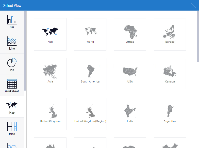
There really are 2 types of maps that are used here, the one labelled simply Map with a black background in the top left, and then every other map in the list. Let’s start with the more widely used type of map, as it should work right away with no modifications needed. We will use 2 examples: the World map and then the USA map.
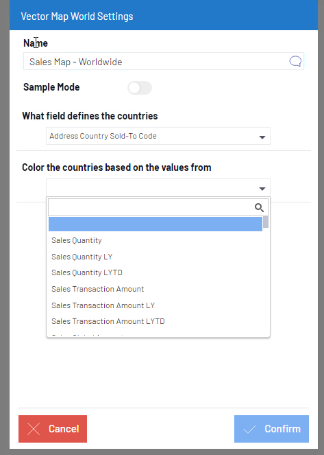
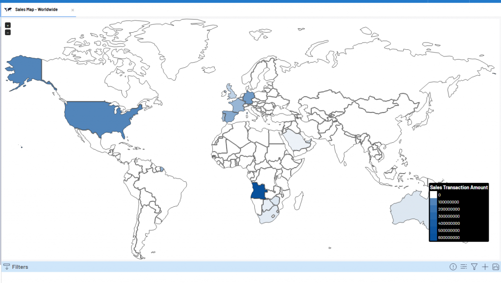
Let’s pick the World option first. On the Settings pop-up which displays afterwards, we need to specify the map name, find the field which defines the country code and then choose the field which will be used to color the countries. In our example, we will use the Sales Transaction Amount:
This is an example of the resulting map. This view can be filtered on any field in the data model, just like you would any other kind of view (so one can filter by sales rep, product line, year, etc.)
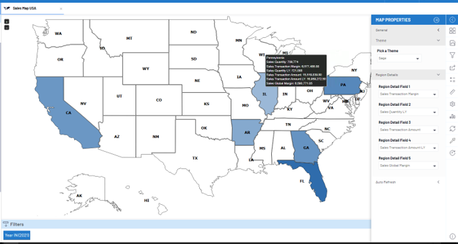
Let’s look at an example for a specific country like USA. It would be created in a very similar way, just by picking the USA map in the list and setting the dropdowns on the settings menu to use the state code
In this example, we can go one step further and associate states with some useful information. After the map is built, one can change its look by clicking on the Map Properties button in the toolbar to the right of the screen. Then, in the Region Details, we can choose which interesting information to display when clicking on a particular screen:
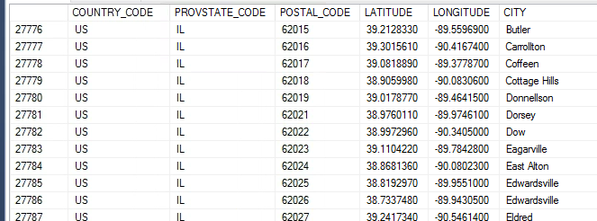
But what if we want to go a step further and want to see the individual customers displayed on the map? This is possible with the other kind of available map view, which interfaces with Google Maps, but requires a bit of extra preparatory work. Specifically, some data to map zip codes and latitude and longitude needs to be uploaded in the MAP table in the Cube database. This kind of information is freely available online from census offices of different countries and can be uploaded to SQL via the SSMS Import function. I recommend using a .xls (Microsoft 97-2003) file for the import file, as it can be uploaded directly in SQL Server Management Studio and one can still have access to most Excel functionality for sorting, formatting and modifying data, etc. In the end, the data in the MAP table should look something like this:
Back in the Sales Cube, we can create a new map using the first map icon in the Map option list. Then make sure to match up the Latitude and Longitude dropdowns with the appropriate fields:
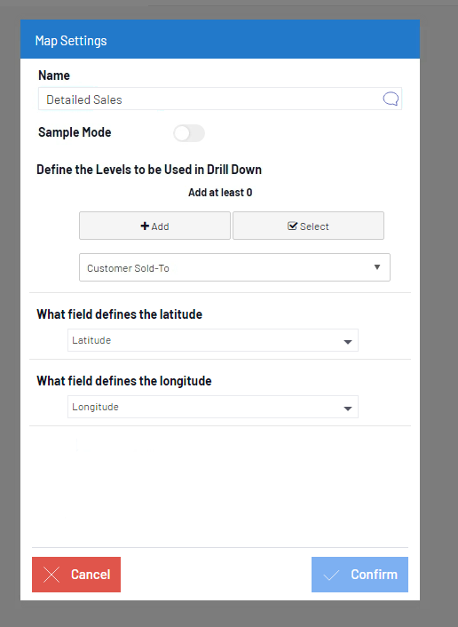
The Drill-down is optional and can also be added later. Now, let’s see the result:
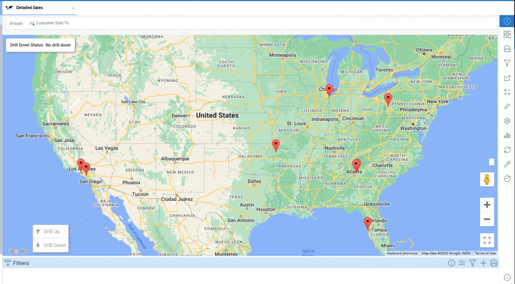
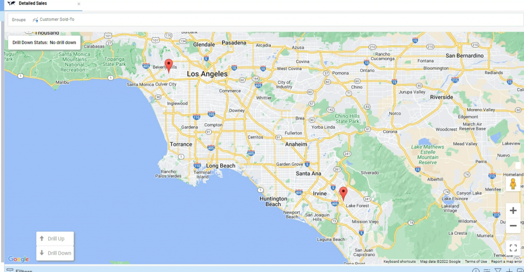
We can see some markers for the exact location of each customer. This is a Google map, so we can zoom in and out as much as you wish:
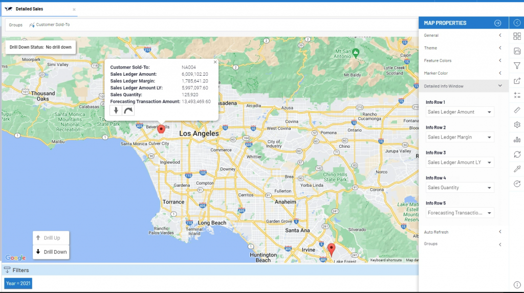
These maps can be treated like other views, meaning that they can be filtered, and various properties can be set. For example, using the Map Properties, we can set a number of different fields to display when clicking on a map marker, to get some useful information on a specific client:
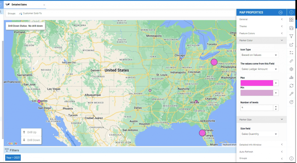
The kinds of markers available can be changed. In this example, the customer markers can have a different color depending on the value of the Sales $ and a different size depending on the sales quantity.
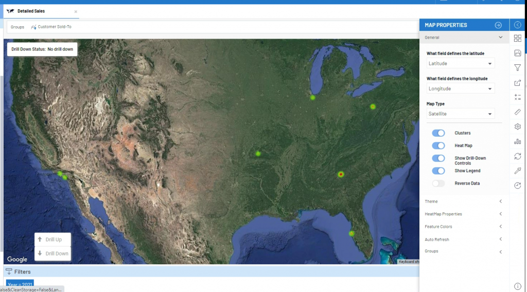
Various other options can be changed. For example, this is the same map, with the Satellite option on and using Heat Maps rather than the marker option:
As you can see, maps are a very interesting way to present sales and purchasing data and can be very useful for a company looking to expand its operations or gain a better understanding in the geographical coverage of its services.
If you have any question about using maps to visualize your company’s data in SEI, please contact us.


